
Back home again after 10 days in Chicago and Lake Geneva WI. Tones of fun, work and a moderate case of Con Crud is the legacy of Gary Con XV!
Hosted and co-hosted several seminars including a two hour seminar where I went over things like the Role of Maps, how my Greyhawk maps have evolved, Porta Potty Scale, Oerth 2.0, Altimira and more. I will go over all of these topics in a series of posts here.
Below is the inside of my convention handout showing a few sample of my new generation of maps.

I also got to play with Ed Greenwood, in person, that was one for my bucket list ticked off. So much fun to meet old friends and new, I even started to like Ravenloft, thanks to DM Dave from GuildSuperior who ran a fantastic game for a large crowd. Despite only rolling up a random character and few minutes of prep time, thanks to a great DM, awesome players I managed to have a ton of fun and do a deep dive into horror and the creepy side of me..
Attended several seminars about various interesting aspects of our hobby and its future which I will try and write up my view on and share with you.
Thank you so much to all of my patreon members, Josh Popp and Gary Con for making me a special guest making my Gen Con trip not only possible but awesome!


An adventure for characters Levels 4-6 for AD&D 1st Edition
Get it here:

The inaugural release by the Len Lakofka Archive: LA 2 Devil's Dung
An adventure for character levels 4-6 for AD&D 1st Edition.
Get it here:
LA 2 Devil's Dung
Leaving for Wisconsin and Gary Con XV in a few days and working frantically to get as much as possible ready. As per previous Gary Cons I'm making a 12 x 17 inch folded print to hand out at my seminar.

The outside, front and back show a bit of my Oerth 2.0 model, shoutouts from my website, patreon and the stuff that are available there now.
Below are the "In the Pipeline" section with a screenshot from World Machine showing a bit of Shield Lands terrain, more Oerth 2.0, a MeyerHawk teaser and finally a mentioning of the Altamira project for Troll Lord Games.
The inside are a sneak peak at my new generation of fantasy maps showing Delard on the Nyr Dyv coast, in both 3D and top down view.

and as a special treat, seen from the south from aboard a ship a mile out. It is in the bottom of the page.
A couple of teasing screenshots showing the Serion Keep, as an area map, top down, encounter maps and used in Owlbear Rodeo.
I also included a screenshot of my Obsidian to show of the versatility of maps, especially if they can be customized to your needs, which the Photoshop screenshot indicates.
The purpose for this handout is to give the seminar attendees something to look at that will inspire them to want to know more and to see first hand what my maps looks like. I know too well the quality of presentation equipment at most venues leaves a lot to be desired, so this is way to make sure participants can get a more accurate picture even if the TV or projector are not that great.
Hopefully I can have it printed and ready for the con. I'll post a PDF for you guys here at the time of the con.
I'll post more of my presentation material as it I get it ready.
Tank you so much for making my trip to Gary Con possible, and a special shout out to Josh Popp and Luke Gygax for hosting me!
Symbols are a key part of cartography and equally so for maps of fantasy settings. Their key job is to quickly convey a lot of information in a pleasing way while also blending in with the map itself. When I started mapping Greyhawk I started with the symbology of the Darlene map and it has evolved from the five settlement icons of the 1983 Glossography. My first change was to colorize them, going with a signal yellow.
After using them for my first campaign I realized more defined settlement sizes where needed, and with them came the Metropolis, City, Town, Village etc. The categories and numbers got established for me during my D&E3E/PF1 era of gaming which are the background behind the categories on the map now.

The basic shapes of the symbols are still there, hopefully a bit more clear and easy to read from a distance. Especially the smallest symbols needed some TLC. Now each category have the same shape, Metropolis are squared, cities hexagonal, towns round and so on. The site symbols have been simplified and works better now I hope, along with a proper dungeon symbol.
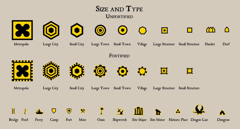
The color scheme are still there. I really like it and find it useful and hopefully it is useful for other as well. The status colors are very useful but I realize now that I might need to change to floating and submerged colors to brighter blue to make them more visible against water.


In a fantasy setting settlements can be run but various forms of creatures beside humans, so have a set of icons reflecting that is both cool and useful. These are the ones I have developed so far, any more needed?

One of the key aspects when developing a symbol set this complex are how to integrate the various competing aspects. I tried to solve this by changing shape, base color, edge color and center symbol. Another aspect are icon simplicity, but to be able to understand it easily, but also to make it into vector format to be used in GIS.
This is a first draft, that I will use as a base when setting up Oerth GIS.
I'm getting ready for the Fantasy Mapping Show on the LordGosumba channel in a few minutes where I will present these and talk more about map symbols.
Its been a few months since I got my new computer with 24 Cores, 128GB RAM and and lots of other performance enhancements, what is it like to work on a fantasy world using state of the art tools? Well to be honest, overwhelming and awesome at the same time. As most of you are well aware of, I have a tendency (to put it mildly) for details, especially in my cartography. Now for the first time I feel I have what it takes to create the maps have always dreamt of, three dimensional terrain in detail enough to satisfy every setting nerds deepest desires.
Having the tools are a good start but far from the whole story, and the next step to mapping nirvana are to tame the software to do your bidding. My main tools for terrain creation are World Machine and Gaea. Gaea can produce them most awe inspiring terrain but still lacks robust river and lake system tools, which are a key part of large scale terrain building in most cases. So my plan was to stick with World Machine for the grunt work and use Gaea for certain features and for final presentation renders. Its been a lot of "World Machine Spaghetti creation the last couple of months"
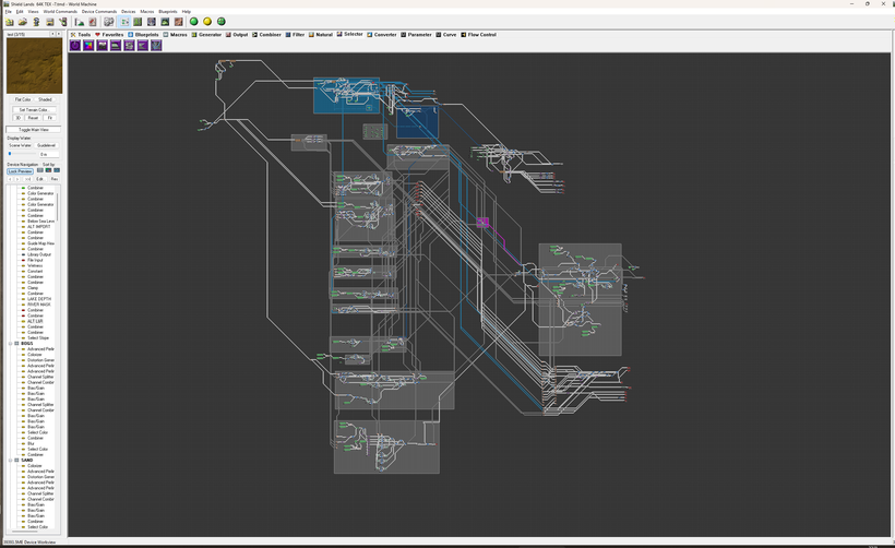
The plan is to start using my Porta Potty Scale of 5ft per pixel, and for a 64K map that is 65,536 x 65,536 pixels covering an area 3,600 square miles. After having made the first renders at this scale it started to dawn on me both how immense the task is and how immersive the results are. Below is the Southern Shield Lands with Scragholme Island, the Veng estuary and a large part of the South Western Shield Lands.
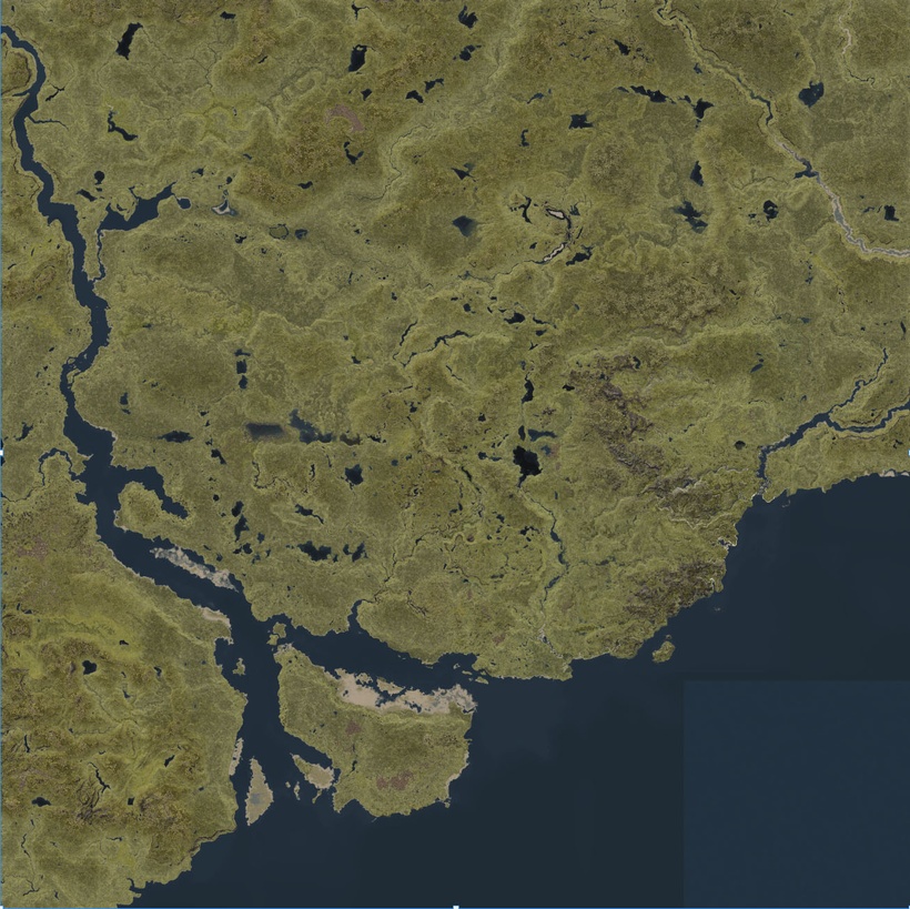
It is impossible to render anything in that high resolution in a single go, on any desktop computer so it has to be made in tiles. All in all 64 of them, each being 8,192 x 8,192 pixels covering 7.5 x 7.5 miles. The heightmap render of all the tiles took about 12 hours which is is about ten times faster than my old computer, meaning I can do ten times more in the same amount of time. A task of this magnitude is way beyond what my old computer could have handled regardless of time.
The results are good, not perfect but definitely good. The tiling process introduces errors, which are a problem but something I'm very aware of and have worked on trying to solve or at least minimize , for years. The main issue is that WM treats each tile as its own little word not aware of the bigger picture. This affects rivers which sometimes flows in opposite directions towards a tile edge where they meetup. Another issue are the general terrain elevation might be higher in some tiles and when the blending sets in to try and smooth over the difference it creates a straight gradient to make the two tiles fit.

Both of these issues have to be adjusted on a tile-by-tile basis afterwards, trying to work out the best way of doing this and are making progress. Thankfully its not every tile border that have issues so its is hopefully possible to adjust these errors afterwards. A large part of the mapping stream this afternoon will be working on this.
When the terrain is rendered it is back into World Machine to render textures and masks. I figured out fairly early that it was best to separate this into two stages, bot for performance, but also to make sure I have a stable and fully detailed heightmap to work from. The preview terrain in World Machine is only the same seen at the full resolution, so it involves a lot of guesswork. This becomes especially annoying when you creating detail texture work with things like rock, beaches and such appearing either nowhere or everywhere depending on where you move the camera. By rendering and exporting the full resolution height map, and then importing into a new file you can do the detailed texture work on a stable defiled terrain set.

The next step is to render the textures and all the accompanying masks at the same resolution of 5ft per pixel, a whopping 1500 files for each 64K area. They are all necessary or useful for the next step, texture editing in Photoshop. This first editing step is crucial to adjust the general color, tone, saturation, contrast as well as blending the all the different textures better. World Machine programming can only take things this far, the final touch up requires a keen eye and a lot of patients.

The key for this phase is to try and make even the areas that lack ay significant features interesting and natural lookin.
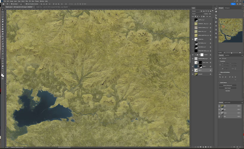
Many billions of pixels spread out over more than a dozen layers are daunting, it is possible to create such a large file in Photoshop but not efficiently working on it. Instead I have decided to go with a "floating" progression, start with a single tile. Enlarge the image to cover the next tile and work on it to match the first area, then save the first area as a separate file, enlarge again and repeat.

This method means that I only need to work on 4 tiles at the most at any given time, which is manageable and still make sure all the tiles fit together. Forest cover, roads and buildings can also be added during this step which makes it much more interesting. Worldbuilding when you have to place settlements, buildings, signs of agriculture, roads and all the other trappings of civilization that can be seen at this resolution is a lot of fun.

Here are alternate versions of the Knurl heraldry for those of you who prefer simpler designs than the cluttered ones from the LG campaign. Above it the County and below is the City.

Thanks to Patrick Schweicher for bringing up this topic!

Time for a little more heraldry, the Furyondian city of Crockport. The design is made by the great Dungeonmeister who have done a lot of Greyhawk related illustrations, you can find his Deviant Art page here: https://www.deviantart.com/dungeonmeister
Here is the simple version of it.

I like the design, it fits the place and its Ferrond and Furyondy roots well.

It is now available on my website!
https://www.annabmeyer.com/atlas-of-the-flanaess-hepmonaland-598-cy-2022-edition/


 Unlock with Patreon